SPA Config
The SPA Config page is where you tune the sportsbook's behaviour and look on your site, per brand — without rebuilding the front-end. Change a URL, flip a feature on, restyle the buttons in your brand colours, and players see it on their next page load.
You'll spend time here when:
- Setting up the initial configuration after integration
- Trying out a new visual theme or testing a feature flag
- Updating the URLs that point at the back-end services your SPA talks to (rare, usually during environment moves)
Preview before you assign
SPA Config changes apply immediately on the next page load. For anything substantial — a new theme, a feature-flag flip, a Pages restructure — use Preview to verify before clicking Assign.
The configuration list
The main view lists every saved configuration, grouped by brand.
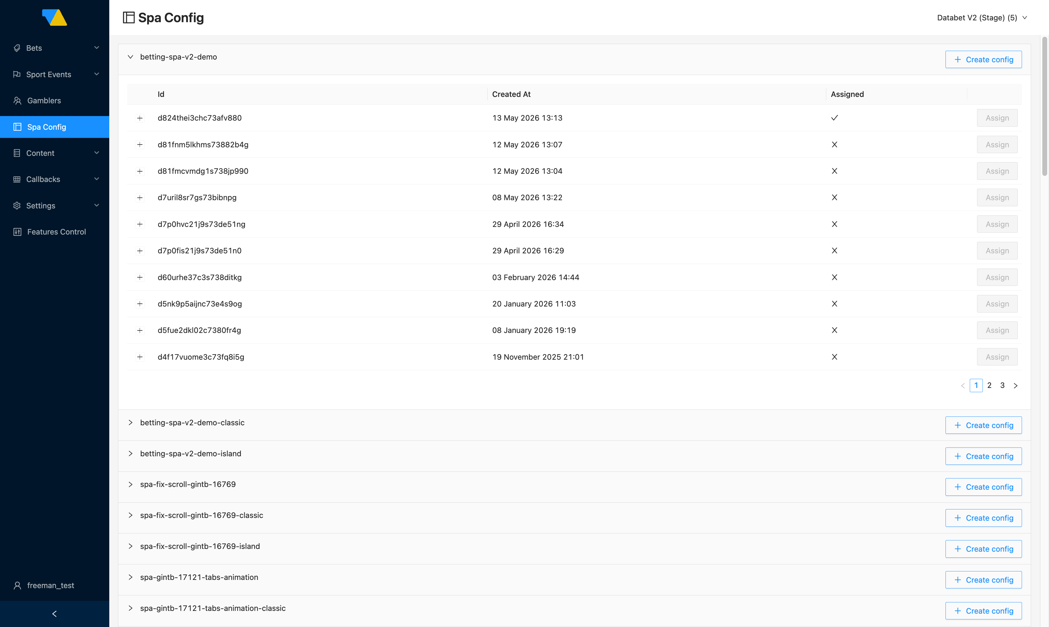
Each brand is a collapsible group. Inside the group:
- Id — the unique identifier of a saved configuration. Click the ID to open and edit it.
- Created At — when the configuration was saved.
- Assigned — a green ✓ marks the version currently live. Every other row shows ✗.
- Assign — promote a different configuration to live (a dialog confirms before applying).
- Create config — at the right of the group header, starts a brand-new configuration.
How to switch the live configuration
- Expand your brand's group.
- Find the configuration version you want to go live.
- Click Assign on its row.
- Confirm in the dialog.
It's live immediately
The change takes effect on the next page load for new visitors. Players already inside the SPA may need to reload to see the change. Only one configuration can be assigned at any time.
How to roll back
There's no separate "rollback" button — to roll back, just Assign the previous configuration. Saved configurations are versioned, so older ones remain available indefinitely until you delete them. (Cleaning up very old versions is a manual operation; if you accumulate many unused versions, ask your integration manager.)
Creating or editing a configuration
Click + Create config for a new one, or click an existing config's ID to open its editor. All sections are on one page — scroll to find them.
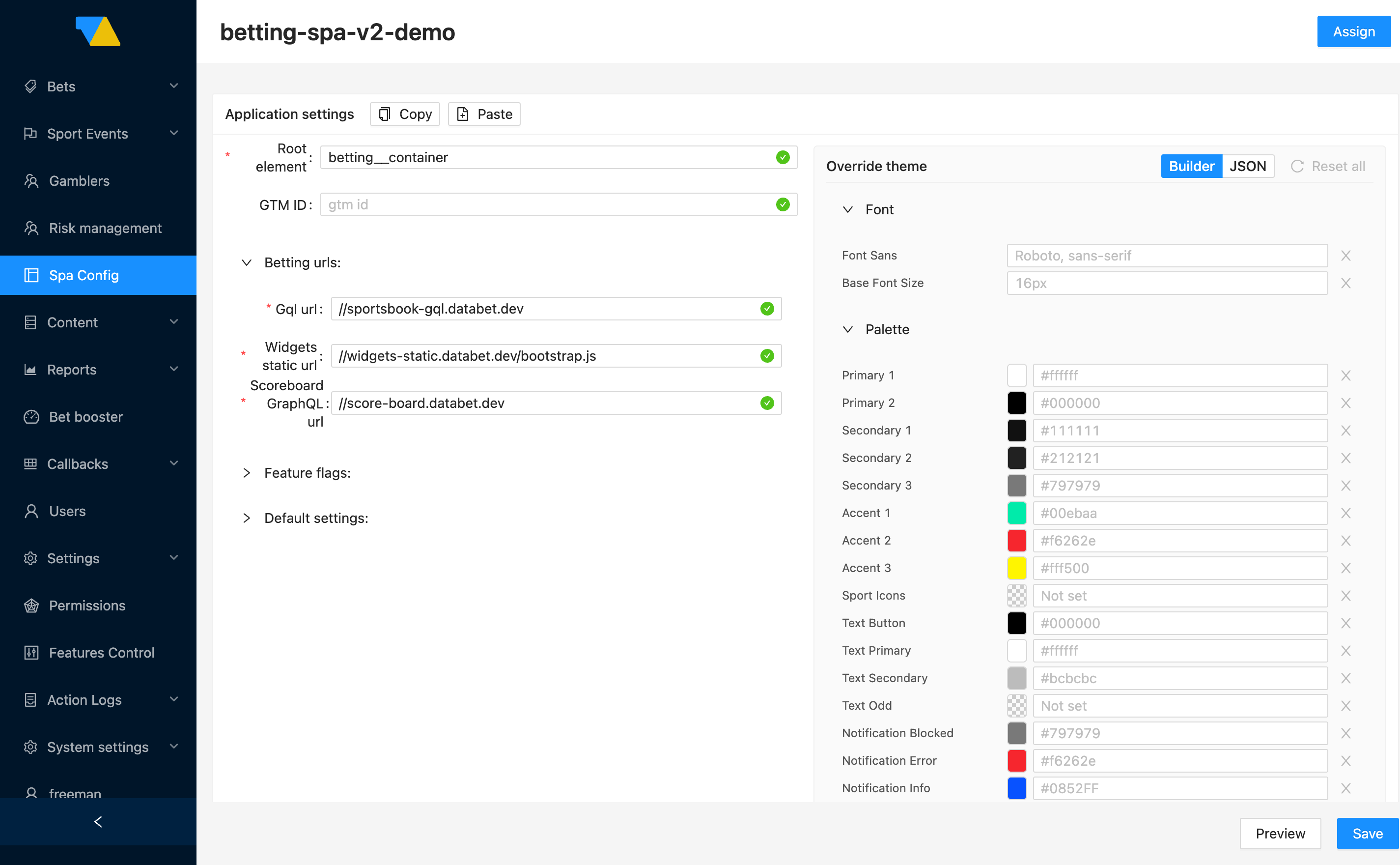
The editor groups settings into a handful of areas, each with its own collapsible section. You don't have to fill in every field — sensible defaults are preserved from the configuration you opened.
Application settings
Two basic settings at the top of the form:
- Root element — the
idattribute of the HTML container where the SPA mounts into your page (e.g.betting__container). Set once during integration and rarely changed. - GTM ID — your Google Tag Manager container ID for analytics. Optional.
Betting URLs
The addresses of the back-end services the SPA talks to:
- Gql url — GraphQL endpoint for sport events, markets, odds, and bets
- Widgets static url — where the SPA loads its widget bundle from
- Scoreboard GraphQL url — endpoint for live scores and stats
DATA.BET manages these for you
These point at DATA.BET-hosted services. We set them up and keep them current — you normally don't need to touch this section. If anything changes (an environment move, a new endpoint), your integration manager will tell you. Pasting wrong URLs here breaks the SPA, so leave them alone unless explicitly asked.
Feature flags
Toggles for SPA behaviours you might want to test or roll out gradually:
| Flag | What it does |
|---|---|
| Memory Router | Navigation happens in-memory — the URL in the browser bar doesn't change as players move between pages. Useful when the SPA is embedded inside another page that owns the URL |
| Skip MaxBet autocorrection | Affects what happens when a player enters a stake larger than the per-bet maximum. Off (default): the SPA silently lowers the stake to the max. On: the stake is left as-typed and the bet is rejected by the betting service with an error. Off is the kinder UX; on is useful when you want players to see explicit max-bet feedback |
| Use expandable tabs | Market groups render as expandable accordion sections instead of fixed tabs |
| Hide predictions tab | The Predictions tab in the SPA navigation is hidden |
Default settings
The initial preferences a brand-new player sees, before they customise anything themselves:
- Event Status —
LiveorPrematch(which tab opens first) - Sport Type —
SportsorEsports - Odd Format —
Decimal,Fractional, orAmerican - Odd Accept Strategy — what to do when odds shift between the player picking and confirming a bet:
- Accept All — silently accept any odds change. Highest conversion, highest operator risk if odds dropped against you between selection and submission
- Accept Higher — accept only when odds went up in the player's favour. The conventional default in most jurisdictions; a good starting point
- Accept Ask — prompt the player to confirm before placing. Safest for the player; lowest conversion
Players can override these
These are just the defaults. Players can change them on the site, and their choices stick to their account.
Layout breakpoints
The screen widths (in pixels) at which the SPA switches between layouts. Each field is the minimum width at which that layout applies — so a value of 1040 for Tablet means "tablet layout kicks in at 1040 px and above" (until the desktop breakpoint takes over). Mobile defaults to 0 because the mobile layout applies from 0 upward.
If you don't have a strong reason to change these, the defaults are fine.
Pages
The Pages section is the routing map of the SPA — which URLs exist, what layout each page uses, and which widgets are placed where. Each tab on this row is one page.
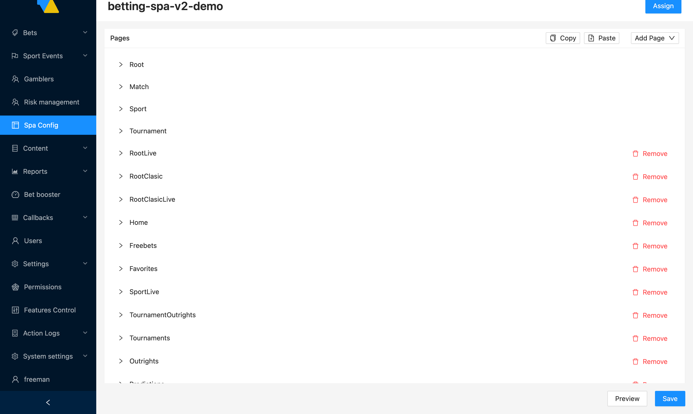
At the top of this section:
- Add Page — add a new page to the routing map (dropdown of available page templates)
- Copy / Paste — copy the entire Pages set from another configuration and paste it here (useful when migrating settings between configs)
Each page's tab can be expanded with the > arrow. Inside you'll see the page's route name (e.g. Root, Match, Sport) and its layout grid + widget placement, edited as JSON.
The Remove button next to optional pages deletes that page from the configuration. Four pages — Root, Match, Sport, and Tournament — are the always-present core; the UI doesn't expose a Remove control next to them and they can't be deleted.
Don't be intimidated by the JSON
Page contents are stored as JSON, but you almost never need to write it from scratch. Most operators copy an existing page and tweak. If you need a brand-new page (one not in any existing config), ask your integration manager — they'll provide the JSON template and the list of available widgets.
Override Theme
The Override Theme section is where you make the SPA match your brand's colours, fonts, and corner styles — without touching the front-end build. There are two ways to edit it, switchable via the Builder / JSON toggle at the top right of the section:
- Builder (default) — visual editor with colour swatches, text fields per token, and a per-token clear button. Recommended for day-to-day work.
- JSON — raw JSON view if you'd rather paste a complete theme object (e.g. a brand kit you've assembled offline).
The Reset all button next to the toggle reverts unsaved theme changes back to the values stored on the config you opened.
Builder
Builder mode groups the theme into four collapsible sections:
| Section | Tokens |
|---|---|
| Font | Font Sans (the font-family string, e.g. Roboto, sans-serif) and Base Font Size (e.g. 16px) |
| Palette | The full set of brand colours — see the palette table below |
| Radius | Six corner-radius tokens (Rounded 2 / 4 / 6 / 8 / 12 / 24) for buttons, cards, inputs |
| Offset | Offset Top — pixel offset to leave room for a fixed header on the surrounding page |
Each token row is:
- The token name
- A colour swatch (clickable — opens the colour picker)
- A text input — you can paste a hex string (
#00ebaa) directly - A small × button — clears the override and falls back to the theme default
Tokens marked Not set in the text input mean "no override; uses the theme default."
Palette tokens
Each token in the Palette section, in the order it appears:
| Token | What it controls |
|---|---|
| Primary 1 | The main background of the SPA |
| Primary 2 | The contrast against the primary background (text, dividers) |
| Secondary 1 / 2 / 3 | Card and panel backgrounds, from darkest to lightest |
| Accent 1 | The main action colour — buttons, links, "place bet" CTAs |
| Accent 2 / 3 | Secondary accents — used for alerts and highlights |
| Sport Icons | Tint applied to sport icons (leave Not set to use Accent 1) |
| Text Button | Text colour rendered on top of Accent 1 buttons |
| Text Primary | Default text colour |
| Text Secondary | Muted text — labels, subtitles |
| Text Odd | Text colour inside odds buttons (leave Not set to use Text Primary) |
| Notification Blocked | Disabled/blocked state colour |
| Notification Error | Error toasts/banners |
| Notification Info | Informational toasts/banners |
| Notification Success | Success confirmations |
| Notification Warning | Warning toasts/banners |
| Betslip CTA Btn Bg | Background for the betslip's primary CTA button (override only; leave Not set to use Accent 1) |
| Betslip CTA Btn Text | Text on the betslip's primary CTA button (override only; leave Not set to use Text Button) |
JSON
Switching to JSON shows the same data as a JSON object. Useful if you want to paste a full theme exported from elsewhere or diff against another configuration.
1 2 3 4 5 6 7 8 9 10 11 12 13 14 15 16 17 18 19 20 21 22 23 24 25 26 27 28 29 30 31 32 33 | |
Always Preview before Save
Builder mode prevents most input errors (the colour picker only emits valid hex), but JSON mode doesn't — Invalid JSON or non-hex values are flagged when you Save. Either way, click Preview before Save to confirm the result on a real page.
Previewing and saving
At the bottom right of the editor you have two buttons:
- Preview — opens a live preview of the SPA using your unsaved changes layered on top of the data the currently-assigned config sees. Great for checking layout and colours before committing. Preview runs against the same back-ends as your real SPA, so be mindful when previewing during peak hours
- Save — saves the configuration as a new version in the list. Does not activate it — return to the list and click Assign to make it live
Saving never overwrites
Saving always creates a new version. You can experiment freely without breaking the version that's live.
Rolling out a change end-to-end
- Open SPA Config in the left navigation.
- Expand your brand's group.
- Click + Create config for a new version (or click an existing ID to open and tweak a copy).
- Make your changes in the editor sections.
- Click Preview to verify it looks right.
- Click Save to create a new configuration version.
- Back on the list, find the new version (it sits at the top) and click Assign.
- Confirm the dialog. The new configuration is live on your site.
- If something looks wrong, return to the list and Assign the previous version — that's your rollback.