Theme Configuration
The Theme interface defines the structure for customizing the visual appearance of the betting system. It consists of four main sections: Font, Palette, Radius and OffsetTop.
The theme can be configured in the following ways:
- Theme Presets (recommended for runtime switching): Define named presets (e.g.
light,dark) in the back-office (SPA Config → Theme Presets) and switch between them at runtime withsetThemePreset(name). See Theme Presets. - At application load: By providing theme options in
bettingOptionsthroughbettingLoader.load(AppInitOptions). - Dynamically at runtime (deprecated): By calling the
updateThemeConfigmethod of theBettingAPI. This approach is deprecated — use Theme Presets instead.
Font
Defines the typography settings for the application.
| Property | Type | Description | Default Value | Example |
|---|---|---|---|---|
fontSans | string | The primary sans-serif font family. | "Roboto, sans-serif" | "Arial, sans-serif" |
baseFontSize | string | The base font size for text elements. | "16" | "14px" |
Palette
Defines the color scheme for the interface, including primary, secondary, and accent colors, as well as text and notification colors.
| Property | Type | Description | Default Value | Example |
|---|---|---|---|---|
colorsPrimary1 | string? | Primary color variant 1. | "#ffffff" | "#FF5733" |
colorsPrimary2 | string? | Primary color variant 2. | "#000000" | "#FF7849" |
colorsSecondary1 | string? | Secondary color variant 1. | "#111111" | "#1E90FF" |
colorsSecondary2 | string? | Secondary color variant 2. | "#212121" | "#4682B4" |
colorsSecondary3 | string? | Secondary color variant 3. | "#797979" | "#5F9EA0" |
colorsAccent1 | string? | Accent color variant 1. | "#00ebaa" | "#FFD700" |
colorsAccent2 | string? | Accent color variant 2. | "#f6262e" | "#FFA500" |
colorsAccent3 | string? | Accent color variant 3. | "#fff500" | "#FF4500" |
textButton | string? | Color for button text. | "#000000" | "#FFFFFF" |
textPrimary | string? | Primary text color. | "#ffffff" | "#000000" |
textSecondary | string? | Secondary text color. | "#bcbcbc" | "#666666" |
textOdd | string? | Text color for odds | Extends from colorsAccent1 | "#666666" |
notificationBlocked | string? | Color for blocked notifications. | "#797979" | "#D32F2F" |
notificationError | string? | Color for error notifications. | "#f6262e" | "#F44336" |
notificationInfo | string? | Color for informational notifications. | "#0852FF" | "#2196F3" |
notificationSuccess | string? | Color for success notifications. | "#00EB81" | "#4CAF50" |
notificationWarning | string? | Color for warning notifications. | "#fff500" | "#FFC107" |
Some widgets declare additional Palette apply only within their own scope and do not affect the overall SPA appearance.
Betslip widget specific theme.palette properties:
| Property | Type | Description | Default Value | Example |
|---|---|---|---|---|
betslipCTABtnBg | string? | Background color of call-to-action (CTA) buttons in the betslip (e.g., "Place Bet", "Sign in"). | Extends from colorsAccent1 | "#1E90FF" |
betslipCTABtnText | string? | Text color of the call-to-action (CTA) buttons in the betslip. | Extends from textButton | "#FFFFFF" |
Example usage:
1 2 3 4 5 6 | |
Radius
Defines the border radius settings for UI components.
| Property | Type | Description | Default Value |
|---|---|---|---|
rounded2 | string? | Xxs | "2px" |
rounded4 | string? | Xs | "4px" |
rounded6 | string? | S | "6px" |
rounded8 | string? | M | "8px" |
rounded12 | string? | L | "12px" |
rounded16 | string? | Xl | "16px" |
rounded24 | string? | Xxl | "24px" |
OffsetTop
The offsetTop parameter is particularly useful when integrating the betting SPA into websites that have fixed headers or navigation bars. When set, it provides the necessary offset for sticky elements within the betting interface to account for the fixed header height.
Example scenarios where offsetTop is needed:
-
Fixed navigation bars at the top of the page
-
Sticky headers that remain visible during scrolling
Configuration example:
1 2 3 4 5 6 | |
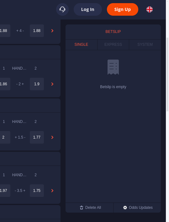
When offsetTop is properly configured, sticky elements within the betting interface will respect the offset and not be hidden behind fixed page elements.
Theme Presets
Theme Presets allow you to define multiple complete, named themes in the DATA.BET back office and switch between them at runtime with a single call - for example, when implementing a Light/Dark mode toggle. Instead of storing and re-applying palettes on your side, you keep one source of truth in the back-office and pass only the preset name.
Configure presets in the back-office under SPA Config → Theme Presets (guide). Each preset is a full theme with the same tokens described above (Font, Palette, Radius, OffsetTop). You name the presets yourself (e.g. light, dark, high-contrast).
Switch at runtime with setThemePreset(name):
1 | |
The first preset you create becomes the default and is applied automatically on load; you can change which preset is the default in the back-office. Until your integration calls setThemePreset, the default preset is active.
Theme precedence
The final theme is resolved by merging several sources. Each source overrides the one above it, so the active preset always wins:
| Priority | Source | Set via |
|---|---|---|
| 1 (lowest) | Built-in defaults | — |
| 2 | Load-time theme | bettingOptions.theme and the deprecated updateThemeConfig |
| 3 (highest) | Active theme preset | setThemePreset, bettingOptions.themePreset, or the default preset |
Presets override updateThemeConfig
While a theme preset is active, any per-token changes made through the deprecated updateThemeConfig method are overridden by the preset, regardless of the order in which the methods are called. Use setThemePreset for runtime theme switching.
Theme config helper
Theme config helper designed to simplify the theme customization process. To access and use it, follow these steps:
-
Open the Demo Site: Navigate to the demo site using the following URL: https://demo-v2.data.bet
-
Enable the Helper via Console: Open your browser's developer console (usually by pressing F12). Then, paste and execute the following command:
1localStorage.setItem("isHelper", true); -
Reload the Page: Refresh the demo site page to apply the changes. The Theme Config Helper should now be active.
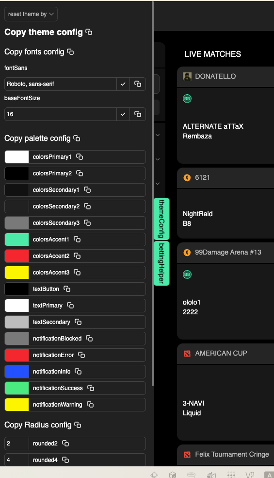
Using this helper, you can easily configure and preview the theme in real-time and copy the ready-made theme configuration for use in your project.