Integrating DATA.BET Widgets
If you have DATA.BET SPA integrated there is no need to set up widgets additionally.
Before integrating the widgets, it is required to integrate Odds Feed first.
The integration of widgets consists of two parts: back-end and front-end. First, on the back-end side, must generate a token to access widgets. Then, on the front-end side, you need to add the script and widget elements to the page.
This section covers the front-end part of the integration.
Importing the script
Add one of the following scripts to your page, depending on the environment you are working in:
1 | |
1 | |
Adding widget elements
After importing the script, you can add databet-widget elements on your page.
Attributes are as follows:
type- type of the widget. There are several widget types you can arrange separately, but the recommended approach is to use a single Multi Widget. Allowed values:token- auth token (see Authorization for details).locale(optional) - language tag defined by RFC 5646. It can be either a two-letter ISO639-1 language code or can contain a region subtag. Examples:en,en-CA. If the locale is not explicitly set, the widget will use the browser’s locale. It falls back toenif not supported.
Examples of adding databet-widget element:
1 | |
1 2 3 4 5 6 7 | |
To determine whether a widget type is available for the sport event, check extensions list app.data.bet/widget in event extensions_updated. In order to display Multi Widget, ensure there is at least one value in the list.
To manage widget types enabled for your account, refer to STM Widget Configuration or contact DATA.BET Integration Manager.
Supported locales
The current list of supported locales is represented in the table below:
| Code | Language |
|---|---|
| bg | Bulgarian |
| cs | Czech |
| da | Danish |
| de | German |
| el | Greek |
| en | English |
| es | Spanish |
| et | Estonian |
| fi | Finnish |
| fr | French |
| hu | Hungarian |
| it | Italian |
| ja | Japanese |
| ms | Malay |
| nl | Dutch |
| no | Norwegian |
| pl | Polish |
| pt | Portuguese |
| ro | Romanian |
| ru | Russian |
| th | Thai |
| tl | Tagalog |
| tr | Turkish |
| uk | Ukrainian |
| vi | Vietnamese |
| zh | Chinese |
The list may expand over time. If you need additional locales, please contact your DATA.BET Integration Manager.
Configuring paywall UI for video stream widget
Video stream widget may be protected by paywall. You can configure the UI indicating your users what steps they need to take to access the widget. The UI will be displayed in the next cases:
- user is not logged in (claim
subin the JWT is empty) - paywall is not passed (see claims
paywall_passedandpaywall_preferencein the JWT)
To configure the paywall UI, add a child element to databet-widget with attribute slot equal to paywall.
Example of configuring the paywall UI:
1 2 3 4 5 6 | |
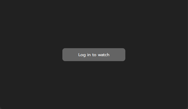
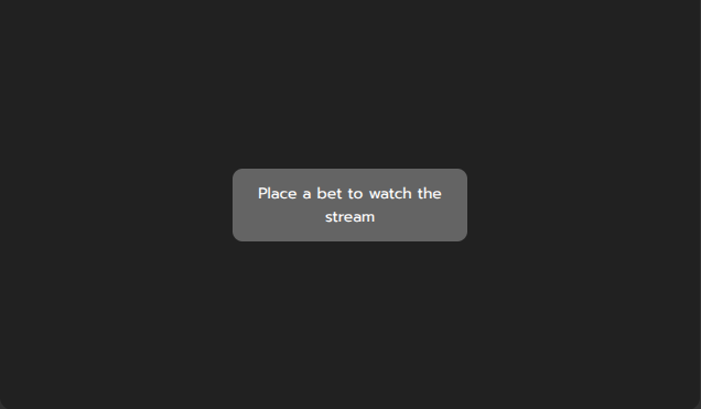
If paywall element is not provided, the default paywall UI will be displayed. Examples:
Note
After the user completes the paywall requirements, make sure to provide him with a new JWT token with the paywall_passed claim set to true.
Handling login button click
In order to improve UX, you may opt to having a button in the default paywall UI when user is not logged in.
Example of Log in button
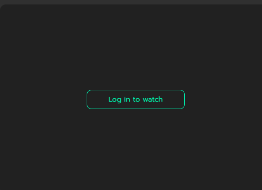
The button can be enabled by your integration manager.
To handle the click, listen for widget:login event on the databet-widget element or its parents (the event is bubbled). Example:
1 2 3 4 5 | |
Customizing the widget
DATA.BET Widgets can be customized to meet your design requirements.
Restricting the size
By default, the widget stretches to 100% of the width and height of the parent element. You can restrict the parent element's size or directly style the widget.
Warning
Setting min-height or max-height instead of height will not make the widget's height responsive.
Some examples of widget styling:
1 2 3 4 | |
1 2 3 4 5 6 | |
1 2 3 | |
The restrictions for minimal widget size are as follows:
| Type | Width | Height |
|---|---|---|
Multi widget (type="multi") | 300 px | 260 px |
| Single widget (other types) | 300 px | 225 px |
Custom CSS variables
You can customize the appearance using custom CSS variables.
General layout customization
CSS Variables for general layout customizations are as follows:
--widget-gap-between-widgets: The gap between widgets in Multi Widget layout.--widget-border-radius: The border radius of widget containers.
Some examples of layout customization:
--widget-gap-between-widgets: 10px vs 30px
--widget-border-radius: 0px vs 20px
Common color customization
CSS Variables for common color customizations are as follows:
--widget-primary-color: The primary color of the widget.--widget-secondary-color(deprecated: use--widget-overlay-bg-colorinstead): The secondary color of the widget.--widget-accent-color: The accent color of the widget.--widget-accent-secondary-color: The secondary accent color, used for highlights that pair with the main accent.--widget-bg-color: The background color of the widget.--widget-single-bg-color: Background color override for single-widget layouts. Falls back to--widget-bg-colorwhen unset.--widget-overlay-bg-color: The background color of overlays, tooltips, and tab selectors.--widget-text-button-color: Text color used inside buttons.--widget-error-color: Color for error states and warning messages.--widget-success-color: Color for success states and positive confirmations.
Some examples:
--widget-primary-color: #4e4eee (Counter-Strike Scoreboard)
--widget-secondary-color: #4e4eee (Dota 2)
--widget-accent-color: #4e4eee (Counter-Strike Scoreboard)
--widget-bg-color: #4e4eee (Counter-Strike Scoreboard)
--widget-bg-color: #8080ff (Dota 2 Pitch Tracker)
--widget-overlay-bg-color
Sports-specific color customization
CSS Variables for sports-specific color customizations are as follows:
--widget-first-team-color: The first team's color in the widget.--widget-second-team-color: The second team's color in the widget.
Definitions of the first and second teams depend on the sport:
| Sport | first team | second team |
|---|---|---|
| Counter-Strike | CT | T |
| Valorant | Defender | Attacker |
| Dota 2 | Radiant | Dire |
| League of Legends | Blue | Red |
Some examples of color customization:
--widget-first-team-color: #4e4eee (Counter-Strike)
--widget-first-team-color: #8080ff (Dota 2)
--widget-second-team-color: #4e4eee (Counter-Strike)
--widget-second-team-color: #8080ff (Dota 2)
Pitch Tracker color customization
CSS Variables for Pitch Tracker-specific color customizations are as follows:
--widget-map-color: The background color of the map in the Pitch Tracker widget.
--widget-map-color: black vs darkslategray
In-Stream Betting color customization
CSS Variables for In-Stream Betting-specific color customizations are as follows:
--widget-stream-betting-bg-color: The background color of the In-Stream Betting overlay.
Adding a custom tab to Multi Widget
To add a custom tab to Multi Widget, add element with attribute slot prefixed with tab-. This utilizes Web Component Slot element. Example of adding a custom tab:
1 2 3 | |
Example of custom tab
Configuring order of widgets in Multi Widget
To configure the order of widgets in Multi Widget, add attribute order to the databet-widget element. The value of the attribute is a comma-separated list of widget types (no spaces between values).
If some of the provided widget types are missing in the Multi Widget, they are ignored.
If Multi Widget contains widget types that not specified in the attribute, they go after the specified ones in the default order. The default order is not guaranteed and may always be changed.
Example of configuring the order of widgets in Multi Widget:
1 | |
In the example above, widgets will be arranged in the following order:
- Video Stream (if available)
- Scoreboard (if available)
- Pitch Tracker (if available)
- ... remaining widgets in the default order
Excluding widgets from Multi Widget
To exclude some widgets from Multi Widget, add attribute exclude to the databet-widget element. The value of the attribute is a comma-separated list of widget types (no spaces between values).
This may be useful if you want to display Multi Widget and arrange a separate widget type somewhere else on the page.
Example of excluding widgets from Multi Widget:
1 2 3 4 5 6 | |
Note
Excluding widgets this way is a front-end customization. To disable widget types for your account, refer to STM Widget Configuration or contact DATA.BET Integration Manager.
Configuring Multi Widget side-by-side layout
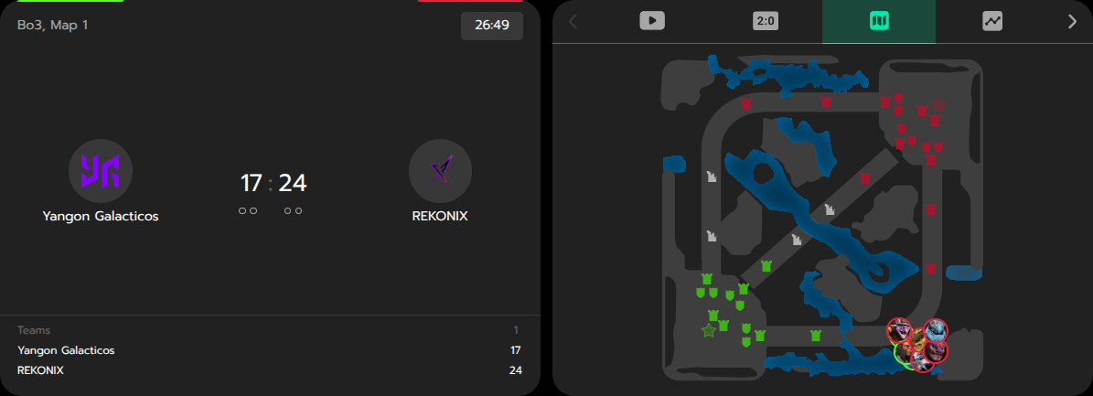
Multi Widget supports side-by-side layout (see example). To enable it, set attribute sideBySideBreakpoint (in pixels). The minimal recommended value is 760. When Multi Widget reaches the breakpoint width, its layout splits into two columns.
Example of configuring Multi Widget layout breakpoint:
1 | |
The widget that goes to the left side is the first one from the Multi Widget. To configure it, use order customization.
Customizing Genius Widget Game Tracker
Genius Widget Game Tracker can be customized adding its own attribtes to the databet-widget element:
geniusLayout- layout of the Genius widget. Allowed values:regular,sideBySide,standalonegeniusWidget- widget type whengeniusLayoutisstandalone(otherwise must not be specified).
Supported values for geniusLayout depend on the sport:
| Sport | regular | sideBySide | standalone |
|---|---|---|---|
| American Football | ✅ | ❌ | ✅ |
| Basketball | ✅ | ✅ | ✅ |
| Football | ✅ | ✅ | ✅ |
| Tennis | ✅ | ✅ | ✅ |
The geniusWidget attribute can only be used when the geniusLayout is set to standalone. This allows you to specify the desired Genius widget type manually.
| Sport | pitchTracker | playByPlay | teamStats |
|---|---|---|---|
| American Football | ❌ | ✅ | ✅ |
| Basketball | ✅ | ✅ | ✅ |
| Football | ✅ | ✅ | ✅ |
| Tennis | ✅ | ❌ | ✅ |
Example of adding databet-widget with custom Genius setup:
1 2 3 4 5 6 | |
Some visual examples:
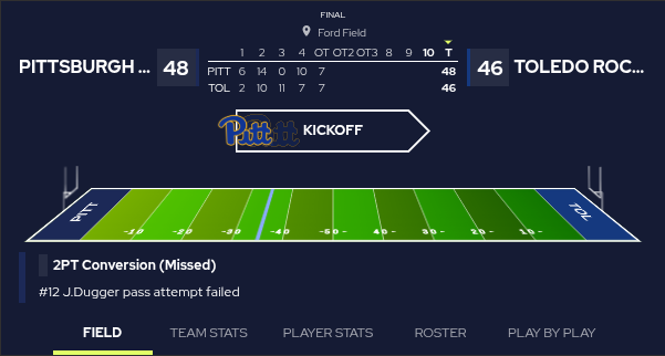
American Football with regular layout
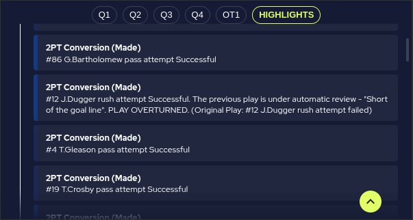
American Football with standalone layout and playByPlay widget
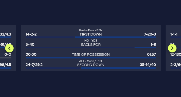
American Football with standalone layout and teamStats widget
JSON customization
To make customization more flexible, DATA.BET Widget allows passing configuration as a JSON string via the widgetconfig attribute. Currently, only Multi Widget can be customized using this approach.
The supported configuration schema is as follows:
1 2 3 4 5 6 7 8 9 10 11 12 13 14 15 16 17 18 19 20 21 22 23 24 25 26 27 28 29 30 31 | |
In the schema above, the only property that requires explanation is labels. It is a dictionary where the key is the widget type (e.g., scoreboard, pitch_tracker, etc.), and the value is the label that will be displayed on the corresponding tab.
Note
If an optional property is set, it will override the css variable if provided.
Example of passing JSON customization to Multi Widget:
1 2 3 4 5 | |
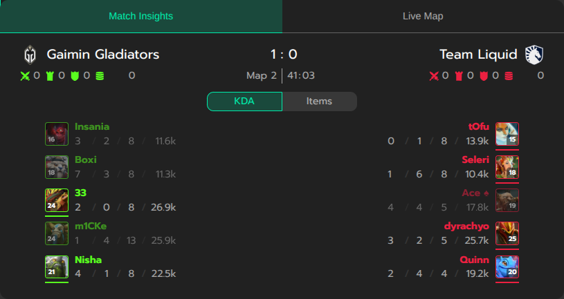
In the example above, the Multi Widget tabs will use Arial, sans-serif font family, the "Scoreboard" tab will be labeled as "Match Insights", and the "Stream" tab will be labeled as "Live Map":
Example of JSON customization above
Observing widget state
The widget reports changes in its state by emitting lifecycle events with type widget:state_changed. Each instance of databet-widget emits its own events. The events are bubbled, so you can also listen for them on any parent element (up to window).
The widget-related payload is stored in the detail property of the event (as per CustomEvent). The payload contains the following properties:
type- indicates the lifecycle event type.mounted- the widget is mounted (fired once after the widget is added to the DOM).error- an error occurred (bad widget configuration, network error, etc.).auth_failed- authentication failed (e.g., invalid or expired token).content_missing- no requested widget types are available for the sport event (attributestypeandexcludeare respected). If the widget is configured correctly, this typically occurs when a requested widget has just become unavailable before the extensionapp.data.bet/widgetis updated (see Adding widget elements). In general, widget availability is eventually consistent with the feed. You may want to handle this event to hide the widget in such cases.loaded- the widget data has been loaded.list_updated- the list of available widget types has been updated (available for Multi Widget).tab_switched- the active tab in Multi Widget has been switched.pip_changed- the Picture-in-Picture mode has been changed.stream_betting_changed- the In-Stream Betting widget has been opened or closed.unmounted- the widget is unmounted (fired once after the widget is removed from the DOM).
message- a textual description of the event.data(optional) - contains additional information depending on the event type.
The payload schema is as follows:
1 2 3 4 5 6 7 8 9 10 11 12 13 14 15 16 17 18 19 20 21 22 23 24 25 26 27 28 29 30 31 32 33 34 35 36 37 38 39 40 41 42 43 44 45 46 47 48 | |
Example of listening for the events in a React component:
1 2 3 4 5 6 7 8 9 10 11 12 13 14 15 16 17 18 | |
1 2 3 4 5 6 7 8 9 10 11 12 13 14 15 16 17 18 19 20 | |
In-Stream Betting
The In-Stream Betting widget extends the Video Stream widget with a betting interface that overlays the broadcast. The widget keeps no betting state of its own — it renders exactly what the client pushes and forwards user actions back as events. The client owns all betting state — bet placement, settlement, balance, and currency.
How it works
Communication runs entirely on CustomEvents dispatched on the widget's root element (<databet-widget>). Every event is created with bubbles: true, composed: true: bubbles lets the event travel up the DOM so any ancestor can listen for it, and composed: true lets it cross the widget's Shadow DOM boundary into your page. Without these flags, listeners outside the widget would never see the event.
Details

- User opens In-Stream Betting
- The user opens the In-Stream Betting overlay on top of the video stream.
- The widget emits
widget:state_changedwith{ type: 'stream_betting_changed', data: { isStreamBettingOpen: true } }. - The client dispatches
widget:instream_betting:configonce — quick-pick stakes, currency, click-confirmation countdown, auth flag. - The client dispatches
widget:instream_betting:datawith the initial snapshot — competitors, scores, market groups, odds. - The client keeps sending
widget:instream_betting:dataon every change of odds / markets / scores. Stable IDs (group.id,market.id,odd.id) ensure the widget does minimal re-renders.
- User picks an outcome
- The user picks an outcome and confirms the stake (after the optional countdown specified in
betClickConfirmationCountdownMs). - The widget emits
widget:instream_betting:bet_placedwith the chosenmarketId,oddId,stake, andoddValueat click time. - The client places the bet on its backend.
- The client dispatches
widget:instream_betting:bet_updatedwith statusPLACED(bet was accepted) orFAILED(with an optionalstatusReason).
- The user picks an outcome and confirms the stake (after the optional countdown specified in
- Bet settles
- When the bet resolves on the backend, the client dispatches
widget:instream_betting:bet_updatedwith statusSETTLED_WINorSETTLED_LOSS, including the finalstakeandrefund. - Settlement events can be sent at any time — even when the widget is closed. The toast notification is shown the next time the user opens In-Stream Betting.
- When the bet resolves on the backend, the client dispatches
- User closes In-Stream Betting
- The user closes the overlay.
- The widget emits
widget:state_changedwith{ type: 'stream_betting_changed', data: { isStreamBettingOpen: false } }. - The client stops the
dataloop to save bandwidth.
Browser tab visibility
Switching to another browser tab and back does not affect the lifecycle — the widget stays mounted and keeps its internal state, so the client does not need to re-emit config or data on tab return. A fresh config + data dispatch is only required when the widget transitions from closed (isStreamBettingOpen: false) back to open.
The available channels are:
| Direction | Event | Purpose |
|---|---|---|
| Client → Widget | widget:instream_betting:config | quick-pick stakes, currency, timeouts |
| Client → Widget | widget:instream_betting:data | competitors, scores, markets, odds |
| Client → Widget | widget:instream_betting:bet_updated | bet placement result and settlement |
| Client ← Widget | widget:instream_betting:bet_placed | user picked an outcome and confirmed the stake |
| Client ← Widget | widget:instream_betting:error | invalid data / config payload |
Lifecycle
The widget broadcasts open/close changes via the global widget:state_changed channel with type stream_betting_changed (see Observing widget state). Use it to know when to start and stop emitting data updates.
Quick start
A minimal client integration that wires up all five channels:
1 2 3 4 5 6 7 8 9 10 11 12 13 | |
1 2 3 4 5 6 7 8 9 10 11 12 13 14 15 16 17 18 | |
1 2 3 4 5 6 7 8 9 | |
1 2 3 4 5 6 7 8 9 10 11 12 13 14 15 16 17 18 19 20 21 22 23 24 25 26 27 28 29 30 | |
1 2 3 4 5 6 7 8 9 10 11 12 13 14 15 16 17 18 19 20 | |
Localization and formatting are entirely on the client side
The widget never translates, formats, or rounds any client-supplied string. Every user-facing value — title, prefix, headers, label, currency, userBalance, oddName, marketName, statusReason, sportEventName, market names in the Layout examples below, etc. — is rendered exactly as provided. Localize text, format odds (decimal vs US, comma vs dot, …), and format monetary values on your side before dispatching config / data / bet_updated.
Event payloads
Defines quick-pick stake buttons, currency, and click-confirmation timing.
1 2 3 4 5 6 7 8 9 10 11 12 | |
Full snapshot of competitors and markets. The widget reuses stable IDs for minimal re-renders.
1 2 3 4 5 6 7 8 9 10 11 12 13 14 15 16 17 18 19 20 21 22 23 24 25 26 27 28 29 30 31 32 33 34 | |
Emitted by the widget when the user picks an outcome and confirms the stake.
1 2 3 4 5 6 7 | |
Sent in response to bet_placed (PLACED / FAILED), or asynchronously later for settlement (SETTLED_WIN / SETTLED_LOSS).
1 2 3 4 5 6 7 8 9 10 11 12 13 | |
Emitted when validation fails on incoming data or config. There is no fallback — the affected section renders nothing until the client sends a valid payload.
1 | |
Layout examples
The widget composes the visual layout from headers, oddDirection, market.prefix, and odd.label. The recipes below cover the most common market types:
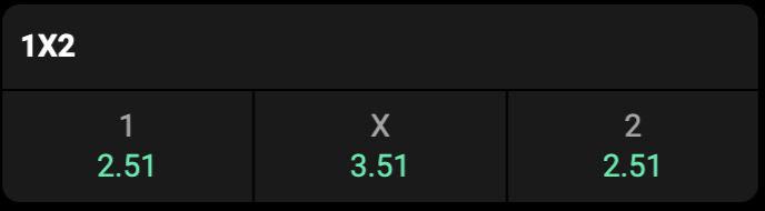
oddDirection: 'COLUMN' (default), no headers. The odd.label carries '1', 'x', '2' and renders above the coefficient.
1 2 3 4 5 6 7 8 9 10 11 12 13 14 15 | |
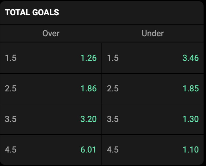
headers: ['Over', 'Under'], oddDirection: 'ROW'. The odd.label is the threshold ('1.5', '2.5', …) and renders beside the coefficient.
1 2 3 4 5 6 7 8 9 10 11 12 13 14 15 16 17 18 19 20 21 22 23 24 25 26 27 28 29 30 31 32 33 34 35 36 | |
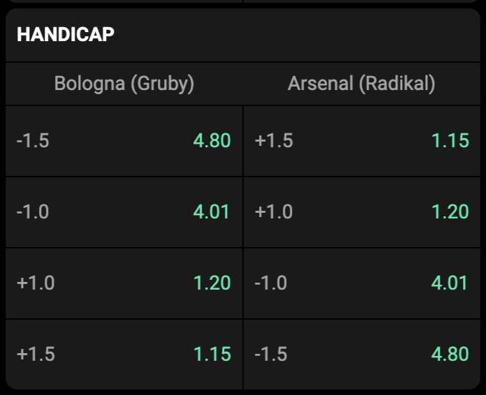
headers: [teamA, teamB], oddDirection: 'ROW'. The odd.label carries the handicap value ('+1.5', '-1.0', …).
1 2 3 4 5 6 7 8 9 10 11 12 13 14 15 16 17 18 19 20 21 22 23 24 25 26 27 28 29 30 31 32 33 34 35 36 | |
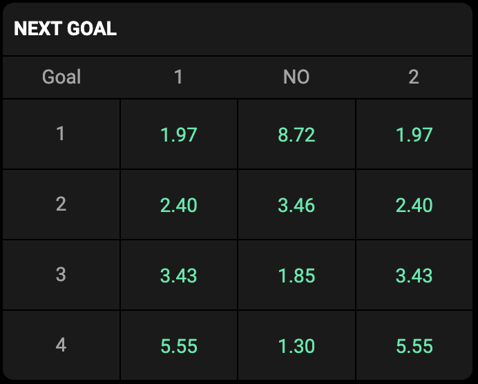
Use this layout for next goal markets — who scores the 1st / 2nd / 3rd / … goal. headers: ['Goal', '1', 'NO', '2'], oddDirection: 'COLUMN'. Each row uses market.prefix to label the goal number on the left.
1 2 3 4 5 6 7 8 9 10 11 12 13 14 15 16 17 18 19 20 21 22 23 24 25 26 27 28 29 30 31 32 33 34 35 36 37 38 39 40 41 42 43 44 | |
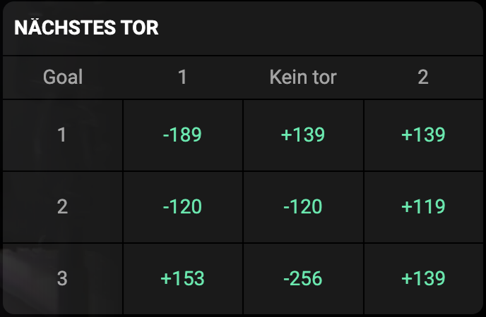
The widget renders every client-supplied string as-is, so the same layout-recipes work for any locale and any odds format just by translating and reformatting the payload. Below are the Total and Next goal examples with German strings and US moneyline odds (+142 / -277-style) instead of decimal (1.42).
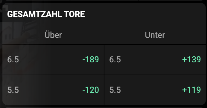
1 2 3 4 5 6 7 8 9 10 11 12 13 14 15 16 17 18 19 20 21 22 | |
1 2 3 4 5 6 7 8 9 10 11 12 13 14 15 16 17 18 19 20 21 22 23 24 25 26 27 28 29 30 31 32 33 34 35 | |
Only the strings (title, headers, label, decimal separators, value format) change between locales and odds-format conventions — oddDirection, market.prefix, IDs, and the overall structure stay identical. Use whatever odds format your audience expects — decimal (1.42), US moneyline (+142 / -277), fractional (5/4), Hong Kong (0.42), etc. The widget never reformats value; do it on the client side before dispatching data.
Quick reference:
| Section | headers | oddDirection | market.prefix | odd.label |
|---|---|---|---|---|
1X2 | — | COLUMN | — | '1', 'x', '2' |
TOTAL | ['Over','Under'] | ROW | — | '6.5', '5.5', … |
HANDICAP | [teamA, teamB] | ROW | — | '+1.5', '-1.0', … |
NEXT GOAL | ['Goal','1','NO','2'] | COLUMN | '1', '2', … | — |
Warning
Section names above are examples, not an enum. Pass any localized string to title / headers / label — the widget renders them as-is.
Rules of thumb:
- Use
oddDirection: 'ROW'when the odd label sits beside the coefficient (handicap, totals). - Use
oddDirection: 'COLUMN'(default) when it sits above (1/x/2 labels). - Use
headersfor a fixed label row above the markets. - Use
market.prefixwhen each row has a left-most label cell (round number, map index). It renders before the odds and counts as one grid column. - Omit
odd.labelentirely if the coefficient speaks for itself.
Full EventData payload covering all layouts
1 2 3 4 5 6 7 8 9 10 11 12 13 14 15 16 17 18 19 20 21 22 23 24 25 26 27 28 29 30 31 32 33 34 35 36 37 38 39 40 41 42 43 44 45 46 47 48 49 50 51 52 53 54 55 56 57 58 59 60 61 62 63 64 65 66 67 68 69 70 71 72 73 74 75 76 77 78 79 80 81 82 83 84 85 86 87 88 89 90 91 92 93 94 95 96 97 98 99 100 101 102 103 104 | |
Design principles
- Render-only contract. The widget never interprets market types or infers business meaning from field values — it renders exactly what the client describes.
- Ready-to-render strings.
title,label,valueare displayed as-is. Translate and format on the client side. - Stable keys at every level. Reuse the same
group.id/market.id/odd.idacross updates. Changing onlyvalueoractivetriggers a single-cell re-render. - The client owns all betting state. The widget never assumes a bet succeeded — it waits for
bet_updated. The widget never tracks balance — pushuserBalanceon everydataupdate. - Always set
bubbles: true, composed: trueon every dispatched event, otherwise it will not cross the Shadow DOM.
Debug mode
Add the debugMode attribute to log every incoming event to the browser console:
1 | |
1 2 3 | |
This is the fastest way to verify your payload reaches the widget correctly.